Haloscape

A UX audit of Haloscape’s health platform, covering its website and mobile app experience.

Role
UX Designer
Timeline
2 Weeks
Year
2026
Team
Haloscape

Overview

A clearer view of your health.

HaloScape is a comprehensive health intelligence platform built around one belief: that truly understanding your body requires seeing the complete picture.

Audit Scope

Reviewing the website and mobile experience

This UI/UX Audit presents a UX audit of HaloScape: an AI powered biometric health platform that unifies sleep, stress, HRV, nutrition, blood test results, cycle and exercise data under a single Halo Score. Key website pages and mobile app screen flows were selected for analysis, chosen based on their centrality to the user journey and their impact on first impressions, daily engagement and data comprehension.

Review Process

Three stages of review

01

Explore

The app was used actively for minimum of 2 days as a real user, going through every screens.

02

Analyze

Few website pages and five screens from the app were selected for structured evaluation.

03

Redesign

The most critical UX issue(across both platforms) identified was selected for redesign. A solution was proposed through designs with clear design decision.

UX Evaluation

A strong visual foundation, with gaps in clarity

The overall experience across the Haloscape Health mobile app demonstrates a strong visual foundation, modern ui interface and well-executed usability patterns. The app also successfully delivers a clean and responsive experience, particularly within the mobile application and research-focused sections.

However, several usability and conversion-related opportunities were identified the landing page. These findings are centered around communication clarity, onboarding guidance, information hierarchy, CTA structure, and trust-building elements.

Experience assessment

A detailed Heuristic Audit Table has also been included within this case study to provide a structured usability assessment based on Nielsen’s usability principles.
AreasEvaluation
Visual DesignStrong
ResponsivenessStrong
Information ClarityModerate
Conversion UXModerate
Onboarding GuidanceWeak
Trust & Social ProofWeak
Content StructureStrong
Mobile App ExperienceStrong

Homepage Audit

Homepage usability findings

The homepage shapes the first impression of Haloscape. This review looks at how clearly it communicates the product, guides visitors, and supports key decisions.
Heuretic findings
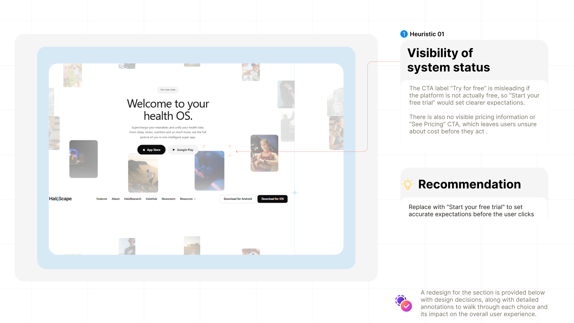
Heuristic 01: Visibility of system status

System Feedback

Keeping users informed and in control
Heuretic findings
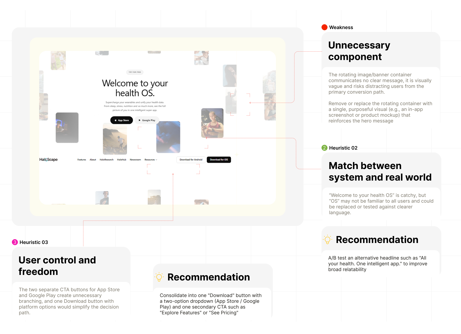
Heuristic 02: Match between system and real world / Heuristic 03: User control and freedom

Error Prevention

Making interactions more predictable
Heuretic findings
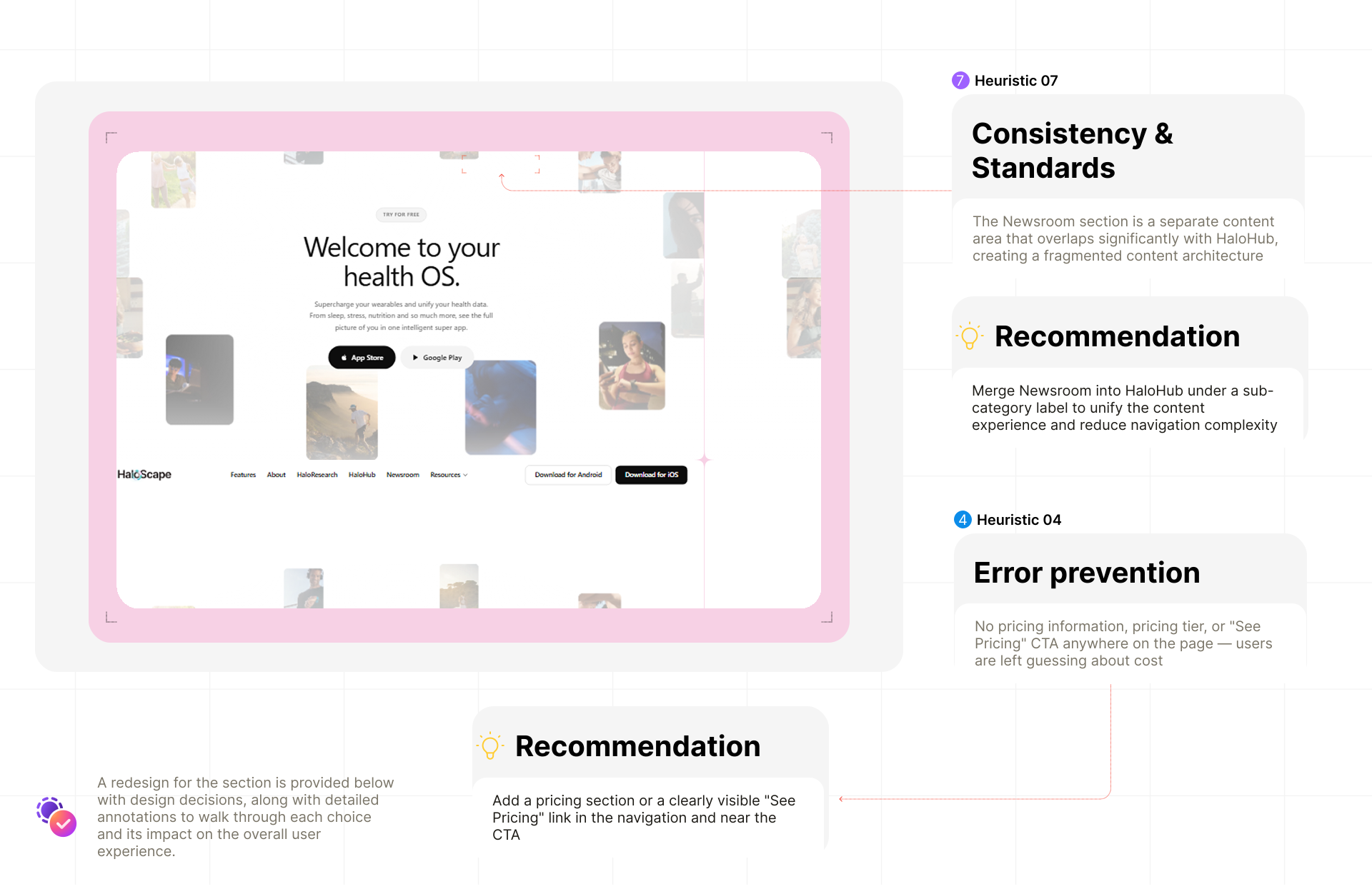
Heuristic 04: Error prevention / Heuristic 07: Consistency & Standards

About & Features Audit

Explaining the product and its value

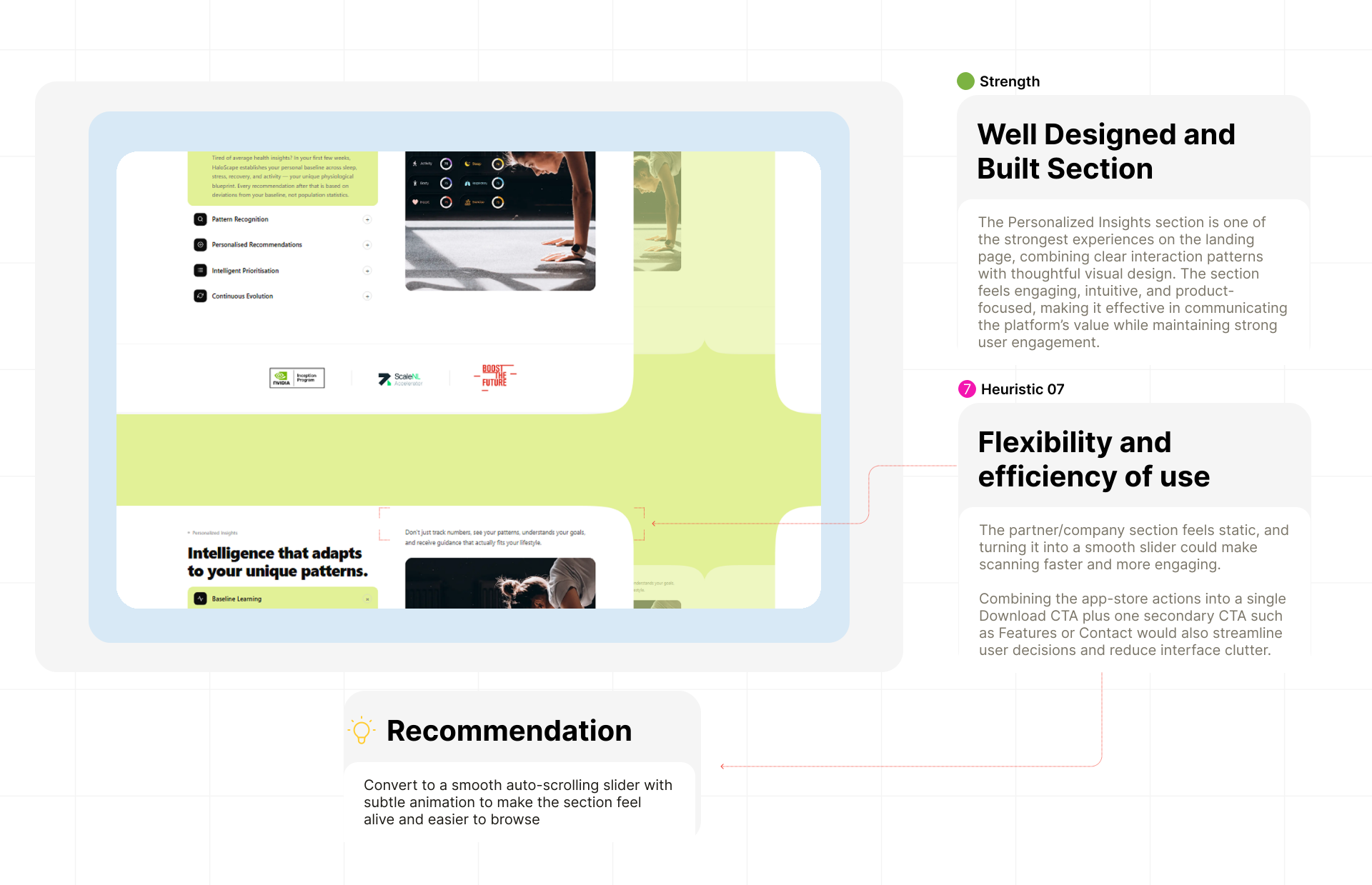
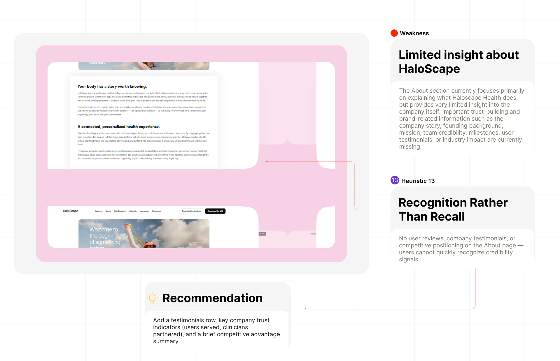
This review considers how the About page and feature content explain the platform, establish credibility, and help visitors understand what it offers.
Heuretic findings
Haloscape features: Flexibility and efficiency of use

Content Discovery

Helping visitors find and recognize information
Heuretic findings
Heuristic 13: Recognition Rather Than Recall

Detailed Heuristic Findings

Ten findings ranked by severity

A review of the site against Nielsen’s usability heuristics. Ten findings, two of them critical, are tied to a page, rated by severity and mapped to the principle they affect.

#Nielsen heuristicPageFindingSeverity
1Visibility of System StatusHomepageCTA label "Try for free" is misleading when the platform is not actually free, users cannot tell what they are committing toCritical
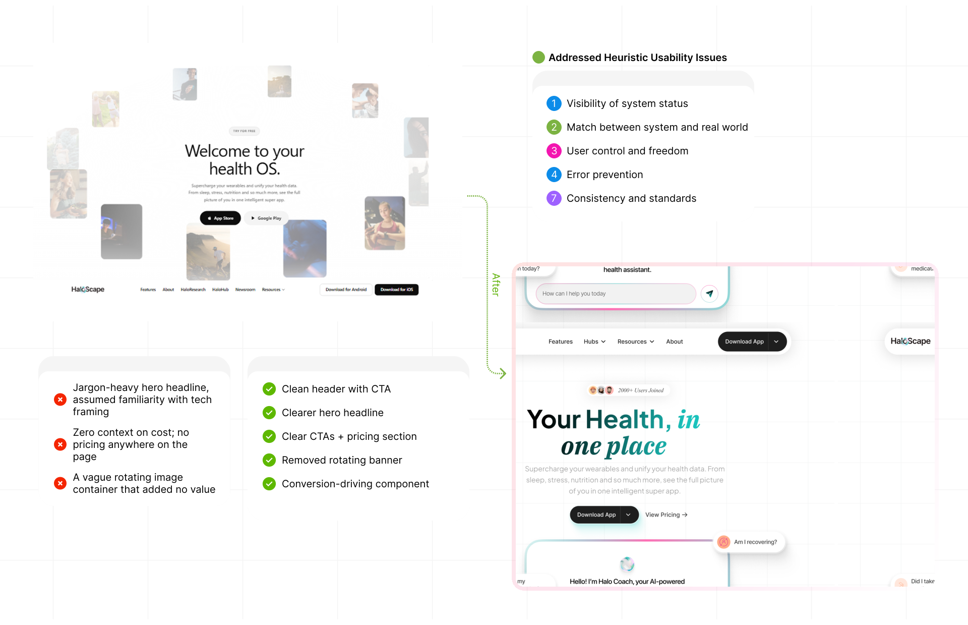
2Visibility of System StatusHomepageNo pricing information pricing tierCritical
3Match Between System & Real WorldHomepage"Welcome to your health OS" uses the term "OS" which is tech-native jargon and may not resonate with general health-conscious usersModerate
4Match Between System & Real WorldAboutThe About page only covers what HaloScape does, it lacks an origin story company missionMajor
5User Control & FreedomHomepageTwo separate CTA buttons (App Store Google Play) create an unnecessary branching decision at the hero level and add visual clutterModerate
6Consistency & StandardsHaloHub / NewsroomThe Newsroom section is a separate content area that overlaps significantly with HaloHub creating a fragmented content architectureMinor
7Error PreventionHomepageThe rotating image/banner container communicates no clear message, it is visually vague and risks distracting users from the primary conversion pathMajor
8Flexibility & Efficiency of UseHomepageThe partner/company logo section is static, making it harder to scan and visually unengaging for returning usersMinor
9Aesthetic & Minimalist DesignHomepageThe rotating image container is visually vague and does not communicate a clear message — it adds noise without adding valueMajor
10Recognition Rather Than RecallHomepageNo "How it Works" or onboarding flow section, users must infer the product journey themselves increasing perceived complexity and setup anxietyMajor

Website Redesign

Applying the audit findings

The redesign focuses on the areas where the audit found the most friction: explaining the product, organizing key information, and making the next step clear.
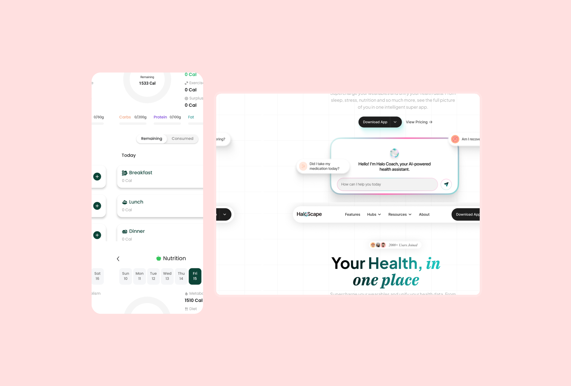
Platform redesign cover

Homepage Redesign

A clearer landing page

The revised page gives the product message, supporting information, and primary action a clearer order.
homepage redesign

Features Redesign

Making the features easier to explore
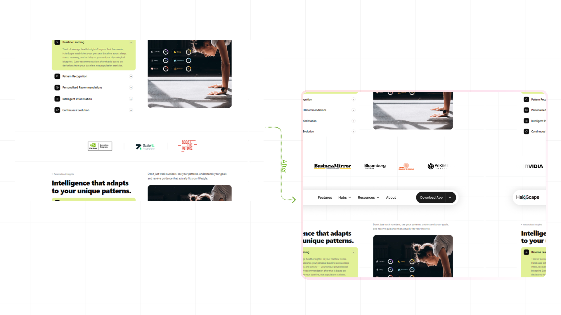
features section redesign

About Page Redesign

Giving the company story more context
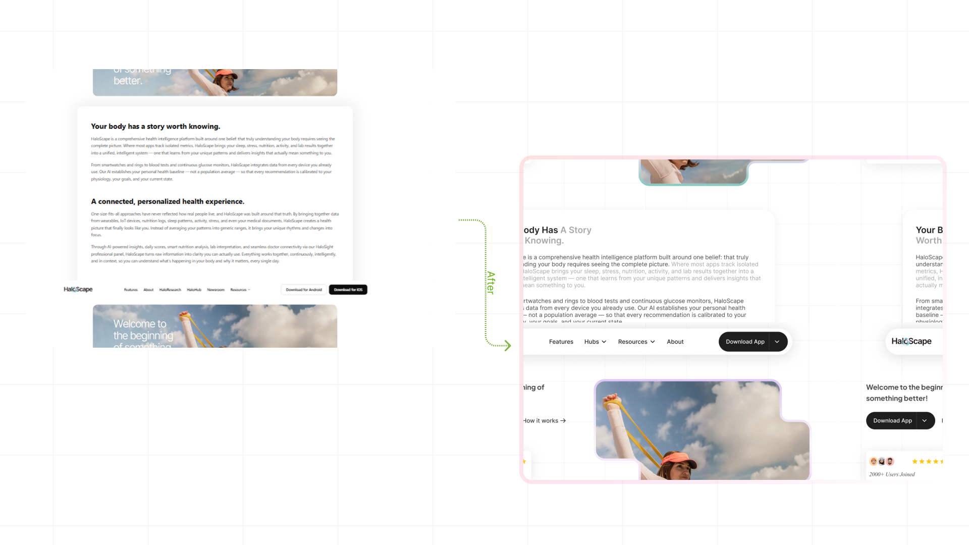
about page redesign

Homepage Prototype

Explore the redesigned landing page

About Page Prototype

Explore the redesigned About page

Mobile App Audit

Assessing the everyday app experience

I mapped the primary user journeys to understand how features, roles, and interactions connect. This helped establish the product structure early, identify the key steps in each journey, and ensure the different flows worked together as one cohesive experience.

App Review Scope

Mobile app review scope
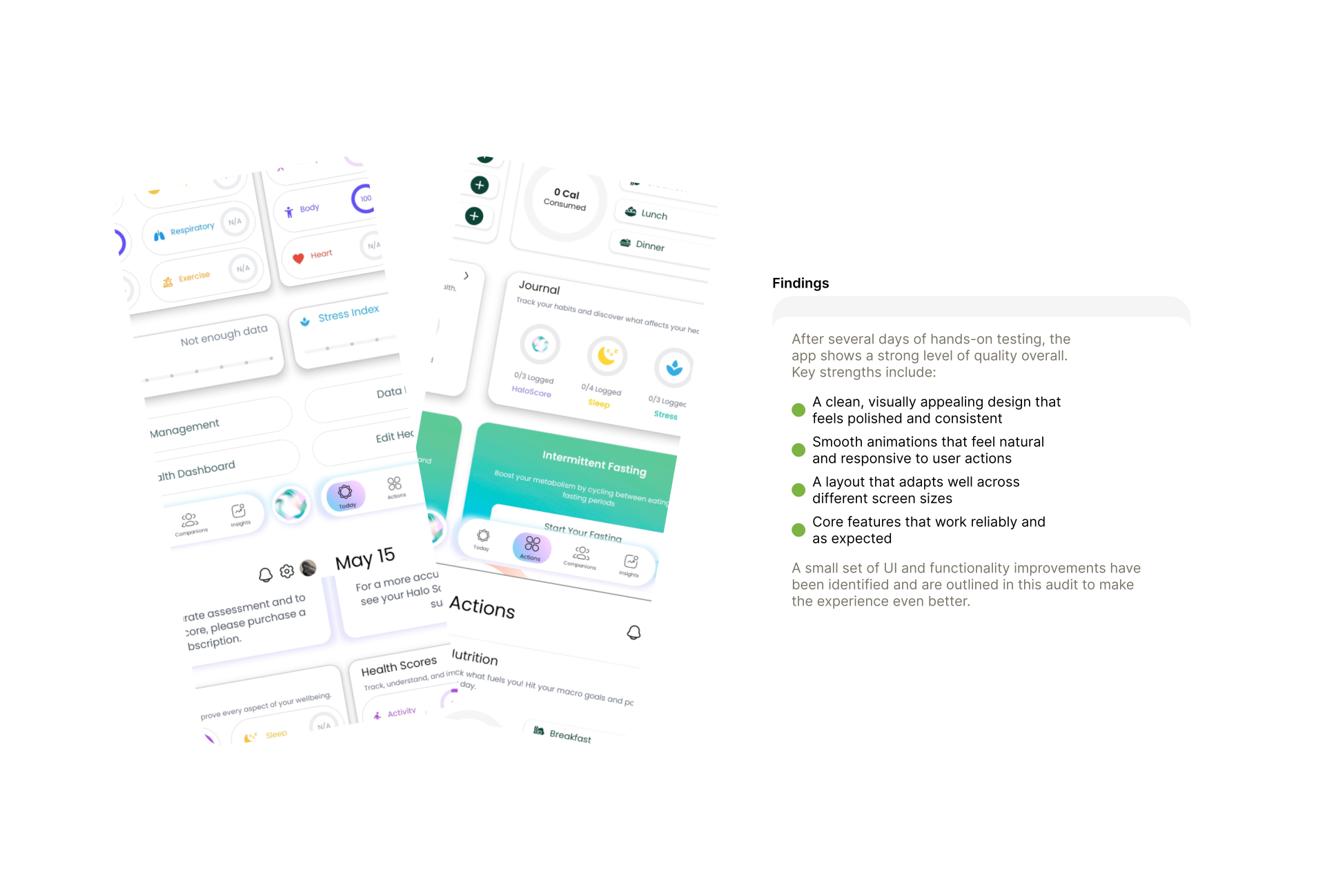
about page redesign

Core Interface

Core interface review

about page redesign

Interaction Review

Interaction and usability review
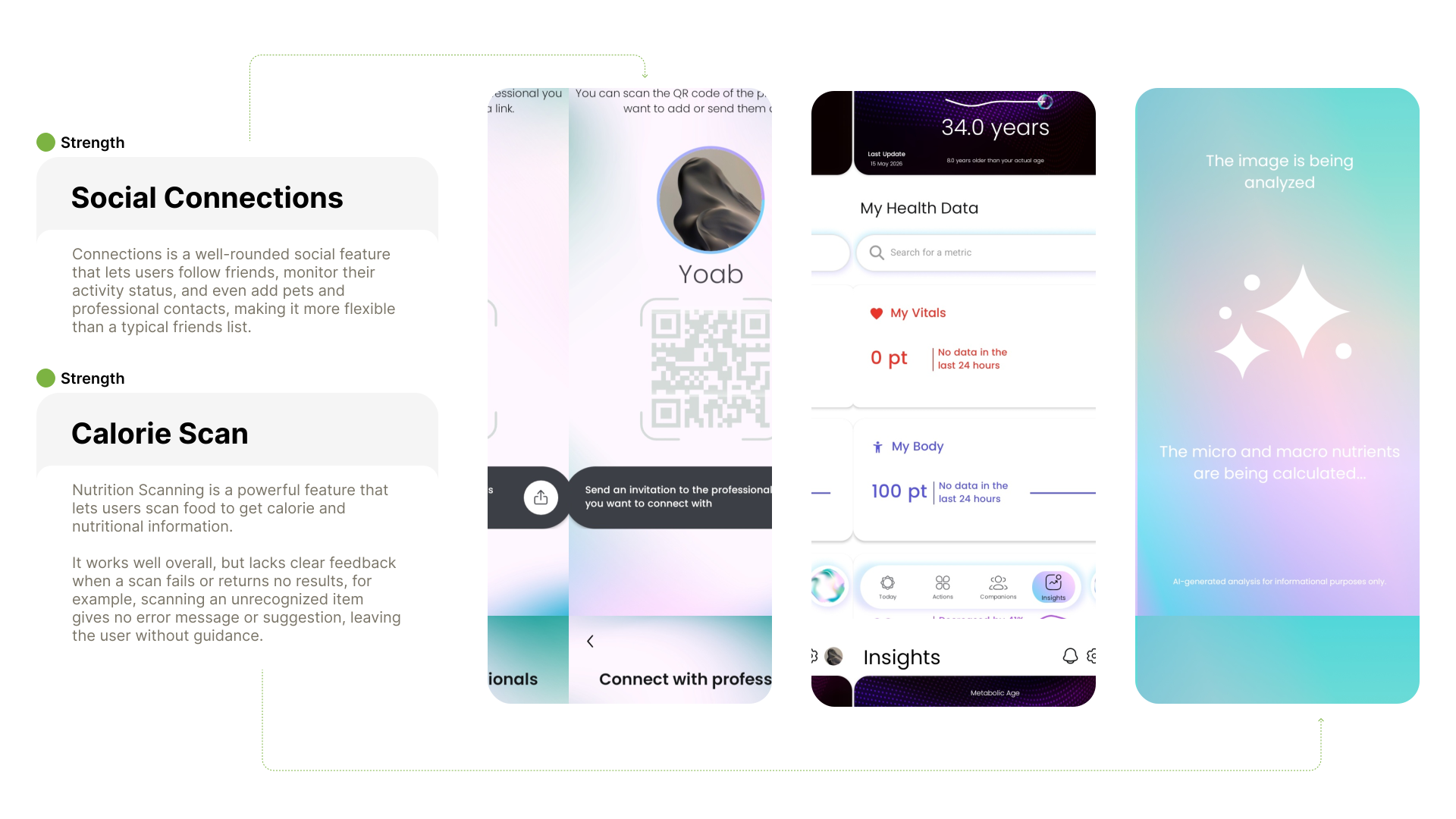
about page redesign

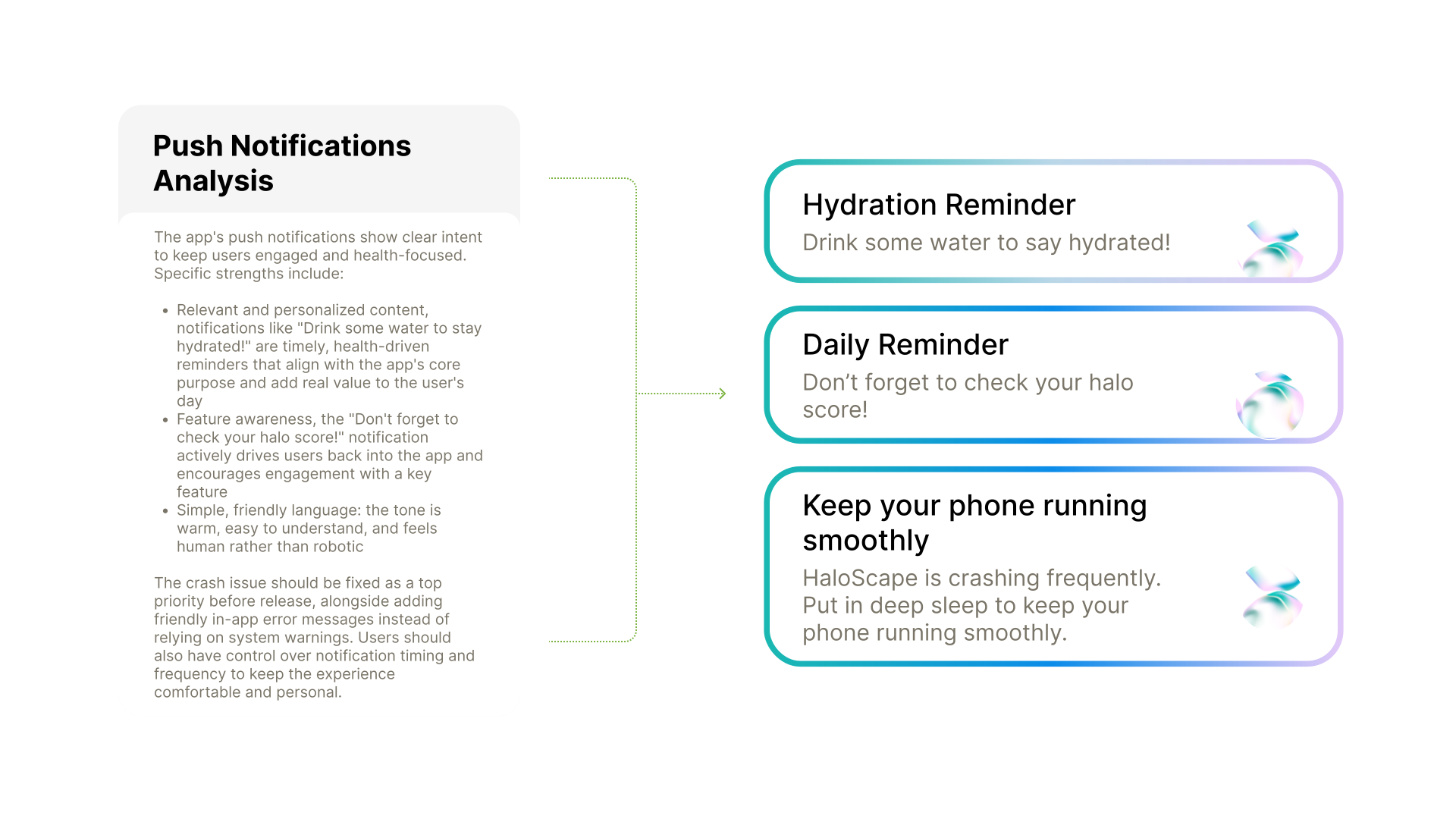
Additional Findings

Additional interface findings
about page redesign

Audit Summary

What the review revealed

The review covered Haloscape’s website and mobile app. It examined key website pages in detail, documented usability issues, and explored redesigns for priority areas. The app was tested over several days, with attention to its interface, responsiveness, animations, and core features.

Key Finding

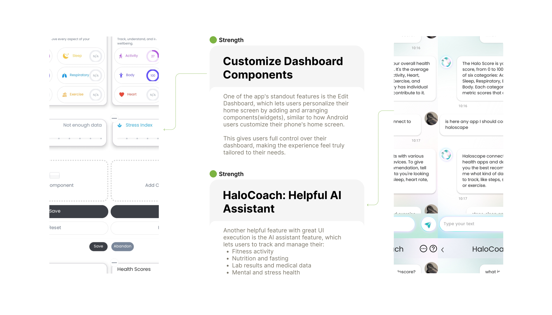
Both the website and mobile app show a strong foundation with a polished visual identity and thoughtful feature set. Standout features like the Edit Dashboard, Nutrition Scanning, and Connections reflect a product built with the user in mind, though targeted improvements in feedback, stability, and notifications would significantly elevate the experience.

Testing limitation

Due to a data tracking limitation encountered during testing, a full analysis of personal health metrics including halo score and progress could not be completed. Overall, HaloScape is a well-built product with clear potential. With the improvements outlined in this audit, it has a strong path toward becoming a polished, reliable, and user-friendly experience that stands out in its space.

Haloscape

A UX audit of Haloscape’s health platform, covering its website and mobile app experience.

Role
UX Designer
Timeline
2 Weeks
Year
2026
Team
Haloscape

Overview

A clearer view of your health.

HaloScape is a comprehensive health intelligence platform built around one belief: that truly understanding your body requires seeing the complete picture.

Audit Scope

Reviewing the website and mobile experience

This UI/UX Audit presents a UX audit of HaloScape: an AI powered biometric health platform that unifies sleep, stress, HRV, nutrition, blood test results, cycle and exercise data under a single Halo Score. Key website pages and mobile app screen flows were selected for analysis, chosen based on their centrality to the user journey and their impact on first impressions, daily engagement and data comprehension.

Review Process

Three stages of review

01

Explore

The app was used actively for minimum of 2 days as a real user, going through every screens.

02

Analyze

Few website pages and five screens from the app were selected for structured evaluation.

03

Redesign

The most critical UX issue(across both platforms) identified was selected for redesign. A solution was proposed through designs with clear design decision.

UX Evaluation

A strong visual foundation, with gaps in clarity

The overall experience across the Haloscape Health mobile app demonstrates a strong visual foundation, modern ui interface and well-executed usability patterns. The app also successfully delivers a clean and responsive experience, particularly within the mobile application and research-focused sections.

However, several usability and conversion-related opportunities were identified the landing page. These findings are centered around communication clarity, onboarding guidance, information hierarchy, CTA structure, and trust-building elements.

Experience assessment

A detailed Heuristic Audit Table has also been included within this case study to provide a structured usability assessment based on Nielsen’s usability principles.
AreasEvaluation
Visual DesignStrong
ResponsivenessStrong
Information ClarityModerate
Conversion UXModerate
Onboarding GuidanceWeak
Trust & Social ProofWeak
Content StructureStrong
Mobile App ExperienceStrong

Homepage Audit

Homepage usability findings

The homepage shapes the first impression of Haloscape. This review looks at how clearly it communicates the product, guides visitors, and supports key decisions.

Heuretic findings
Heuristic 01: Visibility of system status

System Feedback

Keeping users informed and in control

Heuretic findings
Heuristic 02: Match between system and real world / Heuristic 03: User control and freedom

Error Prevention

Making interactions more predictable

Heuretic findings
Heuristic 04: Error prevention / Heuristic 07: Consistency & Standards

About & Features Audit

Explaining the product and its value

This review considers how the About page and feature content explain the platform, establish credibility, and help visitors understand what it offers.

Heuretic findings
Haloscape features: Flexibility and efficiency of use

Content Discovery

Helping visitors find and recognize information

Heuretic findings
Heuristic 13: Recognition Rather Than Recall

Detailed Heuristic Findings

Ten findings ranked by severity

A review of the site against Nielsen’s usability heuristics. Ten findings, two of them critical, are tied to a page, rated by severity and mapped to the principle they affect.

#Nielsen heuristicPageFindingSeverity
1Visibility of System StatusHomepageCTA label "Try for free" is misleading when the platform is not actually free, users cannot tell what they are committing toCritical
2Visibility of System StatusHomepageNo pricing information pricing tierCritical
3Match Between System & Real WorldHomepage"Welcome to your health OS" uses the term "OS" which is tech-native jargon and may not resonate with general health-conscious usersModerate
4Match Between System & Real WorldAboutThe About page only covers what HaloScape does, it lacks an origin story company missionMajor
5User Control & FreedomHomepageTwo separate CTA buttons (App Store Google Play) create an unnecessary branching decision at the hero level and add visual clutterModerate
6Consistency & StandardsHaloHub / NewsroomThe Newsroom section is a separate content area that overlaps significantly with HaloHub creating a fragmented content architectureMinor
7Error PreventionHomepageThe rotating image/banner container communicates no clear message, it is visually vague and risks distracting users from the primary conversion pathMajor
8Flexibility & Efficiency of UseHomepageThe partner/company logo section is static, making it harder to scan and visually unengaging for returning usersMinor
9Aesthetic & Minimalist DesignHomepageThe rotating image container is visually vague and does not communicate a clear message — it adds noise without adding valueMajor
10Recognition Rather Than RecallHomepageNo "How it Works" or onboarding flow section, users must infer the product journey themselves increasing perceived complexity and setup anxietyMajor

Website Redesign

Applying the audit findings

The redesign focuses on the areas where the audit found the most friction: explaining the product, organizing key information, and making the next step clear.

Platform redesign cover

Homepage Redesign

A clearer landing page

The revised page gives the product message, supporting information, and primary action a clearer order.

homepage redesign

Features Redesign

Making the features easier to explore

features section redesign

About Page Redesign

Giving the company story more context

about page redesign

Homepage Prototype

Explore the redesigned landing page

About Page Prototype

Explore the redesigned About page

Mobile App Audit

Assessing the everyday app experience

I mapped the primary user journeys to understand how features, roles, and interactions connect. This helped establish the product structure early, identify the key steps in each journey, and ensure the different flows worked together as one cohesive experience.

App Review Scope

Mobile app review scope

about page redesign

Core Interface

Core interface review

about page redesign

Interaction Review

Interaction and usability review

about page redesign

Additional Findings

Additional interface findings

about page redesign

Audit Summary

What the review revealed

The review covered Haloscape’s website and mobile app. It examined key website pages in detail, documented usability issues, and explored redesigns for priority areas. The app was tested over several days, with attention to its interface, responsiveness, animations, and core features.

Key Finding

Both the website and mobile app show a strong foundation with a polished visual identity and thoughtful feature set. Standout features like the Edit Dashboard, Nutrition Scanning, and Connections reflect a product built with the user in mind, though targeted improvements in feedback, stability, and notifications would significantly elevate the experience.

Testing limitation

Due to a data tracking limitation encountered during testing, a full analysis of personal health metrics including halo score and progress could not be completed. Overall, HaloScape is a well-built product with clear potential. With the improvements outlined in this audit, it has a strong path toward becoming a polished, reliable, and user-friendly experience that stands out in its space.

/

Haloscape

/

Haloscape

/

Haloscape

Designed + Developed by Yoab

Designed + Developed by Yoab

Create a free website with Framer, the website builder loved by startups, designers and agencies.